The psychology of color: 5 fall pairings that command attention
These combinations don’t just look good, they shift how you’re seen (and how you show up)

I’ve always found fashion “rules” stifling. Don’t mix brown and black. Don’t wear color to work. Don’t clash cool and warm tones.
The problem? Rules like that are exactly what keep so many women from feeling seen. Especially in environments where it already feels like there’s one “acceptable” way to show up, like male-dominated industries where the unspoken dress code is navy, black, or beige.
But style isn’t about playing by someone else’s rules. It’s about mastering your own.
This fall, I’m loving unexpected color pairings that not only look elevated but shift the energy of how you show up, helping you project confidence, credibility, and individuality in equal measure.
Here are my five favorite combinations, and the psychology behind why they work.
Chartreuse + Brown: The Confident Disruptor
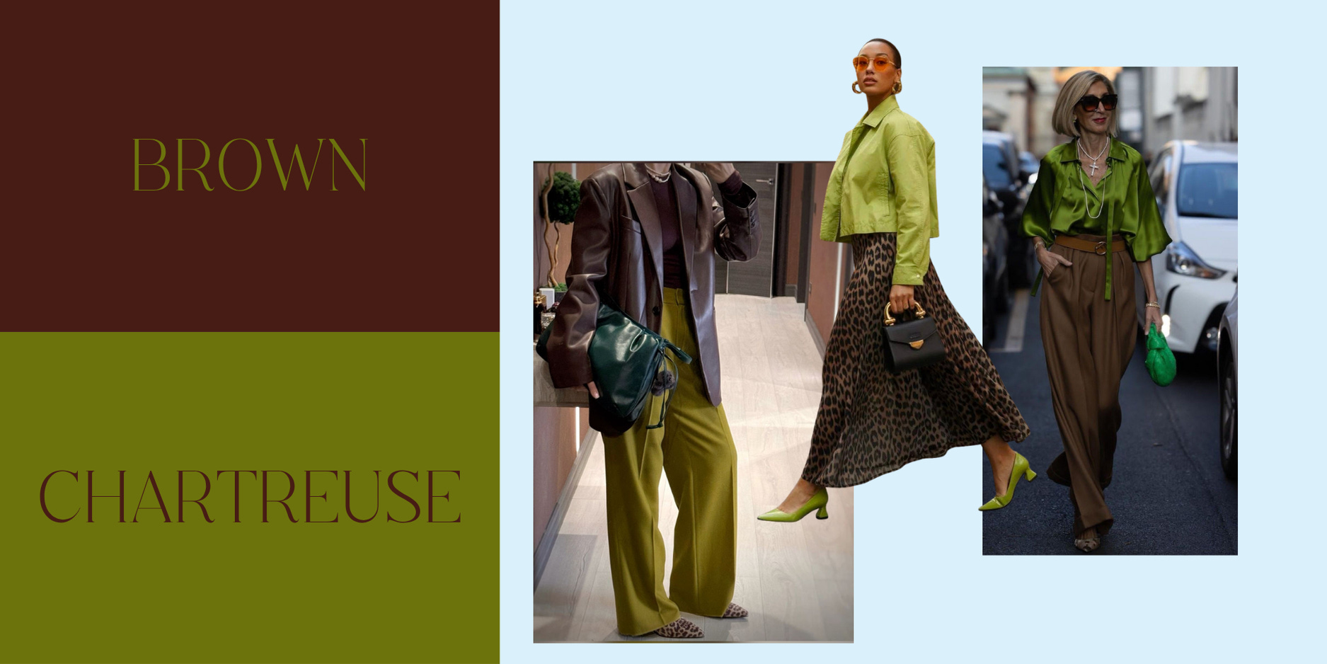
Chartreuse is energy in color form, it signals innovation, creativity, and a willingness to be seen. Brown grounds it, adding an earthy authority that keeps the combination from feeling too bold.
Why it works visually: The warmth of brown tempers chartreuse’s punch, creating instant depth and balance.
How it impacts perception: Together, they communicate confidence and competence, you’re the person who brings new ideas and follows through on them.
How to wear it: Brown trousers with a chartreuse knit or scarf. Or try a camel coat over a chartreuse blouse for a look that’s quietly commanding.
Baby Blue + Burgundy: The Modern Power Pair
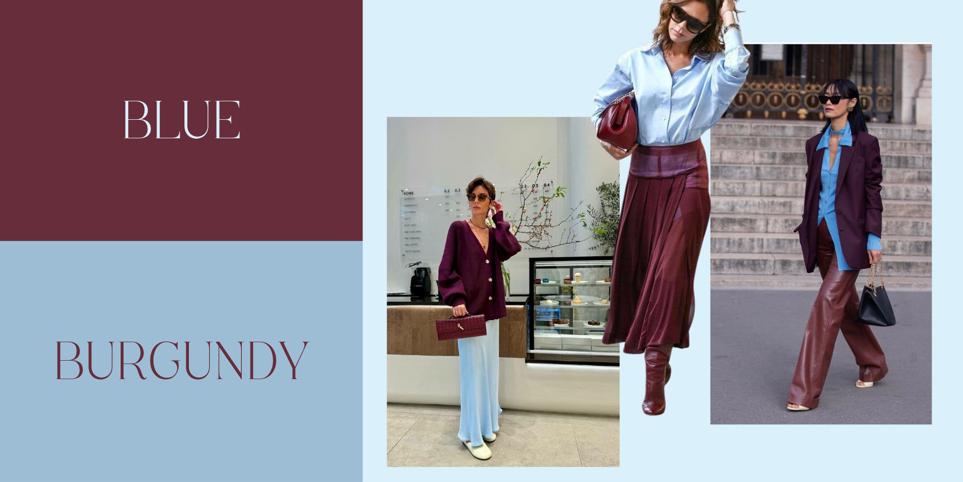
This duo blends calm confidence with quiet strength.
Why it works visually: Cool and warm tones play off one another beautifully, making each color feel more dimensional.
How it impacts perception: Blue evokes trust, reliability, and intelligence, traits that build authority. Burgundy adds depth and decisiveness, showing you can lead with both warmth and conviction.
How to wear it: A light blue blouse under a burgundy blazer, or denim paired with oxblood boots for a more relaxed take.
Aubergine + Grey: The Subtle Standout
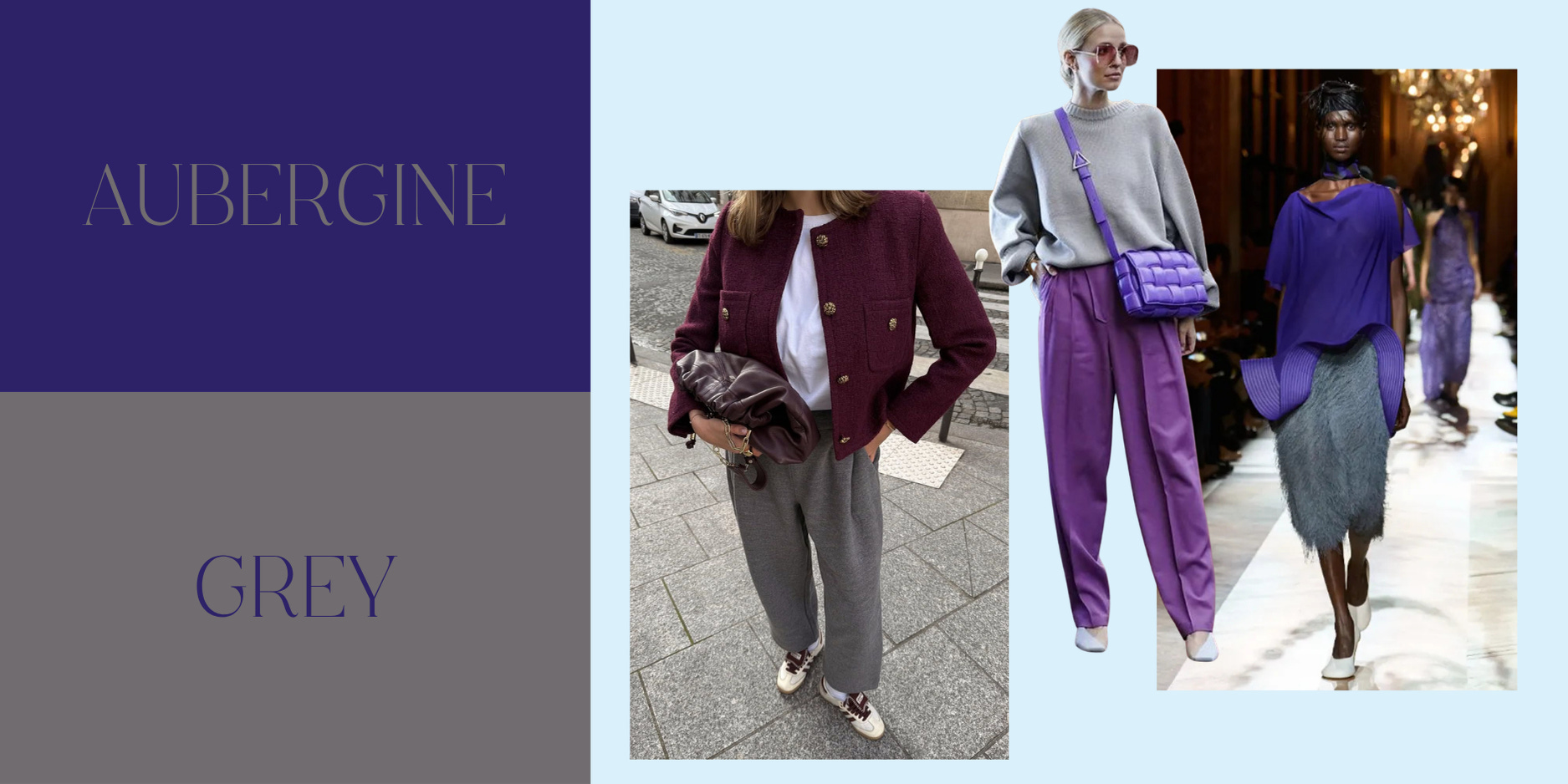
A pairing for the woman who doesn’t need to be the loudest in the room to be remembered.
Why it works visually: The richness of aubergine gains sophistication when paired with soft grey.
How it impacts perception: Purple tones are associated with creativity, intuition, and wisdom, qualities often undervalued in corporate culture. Grey balances that imaginative energy with logic and stability, signaling that your ideas are both visionary and grounded.
How to wear it: A charcoal suit with a plum shell or heather-grey knit over an aubergine midi skirt.
Maroon + Pink: The Feminine Power Move
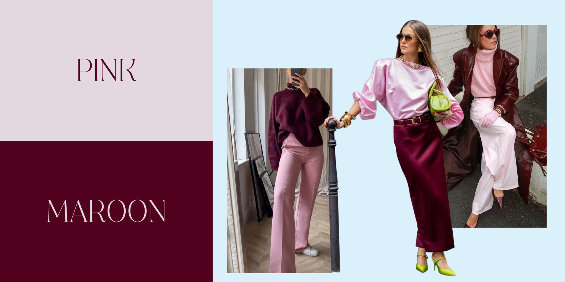
This is color theory’s version of emotional intelligence — strength with approachability.
Why it works visually: Tonal pairing creates depth without stark contrast, making it chic yet approachable.
How it impacts perception: Maroon signals control and self-assurance, while pink introduces empathy, openness, and warmth. Together, they say: “I can lead with strength and still be human.”
How to wear it: A pink knit under a maroon blazer, or a blush blouse with tailored maroon trousers.
Navy + Denim: The Effortless Neutral
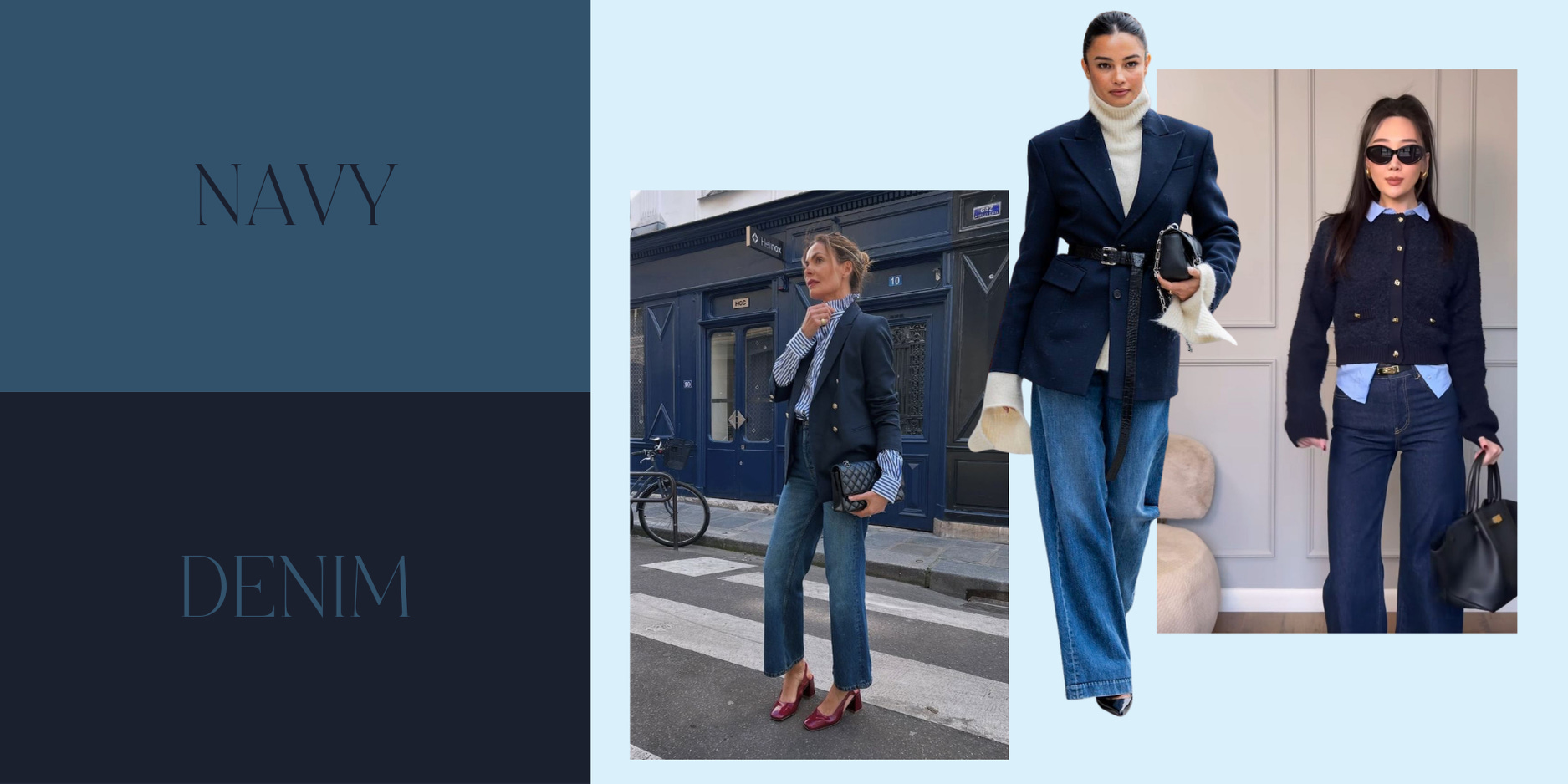
Sometimes authority doesn’t come from standing out, it comes from refinement and consistency.
Why it works visually: Layering tonal blues creates subtle contrast and visual cohesion.
How it impacts perception: Navy communicates trust, discipline, and authority, the color of stability and strategy. Denim introduces authenticity and ease, balancing the formality. Together, they embody approachable professionalism.
How to wear it: A navy wool coat over denim, or navy trousers with a chambray shirt.
When you understand the psychology behind what you wear, color becomes more than just style, it becomes strategy.
Each combination has its own energy.
Each communicates something about how you see yourself and how you want others to see you.
You don’t need to follow the old rules to be respected. You just need to learn how to express your power your way.
And that’s what modern style is really about: rewriting the narrative of what it means to look “professional.”
xx,